Thursday, 30 April 2015

Shoot 10 Work Diary

I wanted to attempt to capture movement in a different way from my last shoot. I wanted to use multiple flash photography in order to capture a more visually interesting range of movement. I came across some issues with images being too bright or too dark but after experimenting with different examples of movement I was able to create some interesting examples.


This image shows a range of movement in a way that flows more naturally than static images would show. The black and white contrast allow for the image to be more noticeable in order to direct audiences attention to the movement of the person. The image is also able to depict how fast the person was travelling depending on the severity of the motion blur. Tone is used within this image in order to show journey. The person begins with a bright colour and begins to slowly grow darker and darker, the further he goes.


This image shows movement in a simple form. Three simple, static images are used to show the range of movement. This image focuses on the movement of an object as opposed to a person and is made more interesting by using the same person multiple times within the same image. The use of black and white highlight the contrasts within the image. The contrasts are used to highlight the person and their range of movements.

Progression:

If I were to do this shoot again I would like to experiment with different shutter speeds, lighting and backgrounds in order to create more varying styles of image. I would also look to create a more consistent image by adjusting the brightness and lights of the image in order to capture a better quality of image.

Connecting Essay 5


This image features pattern within a natural structure. The image depicts distance by showing the progression of the same object and the way it changes over a distance. A black and white filter is used  in order to enhance the shadows of the image while using form to show how the objects reduce in size over a distance.


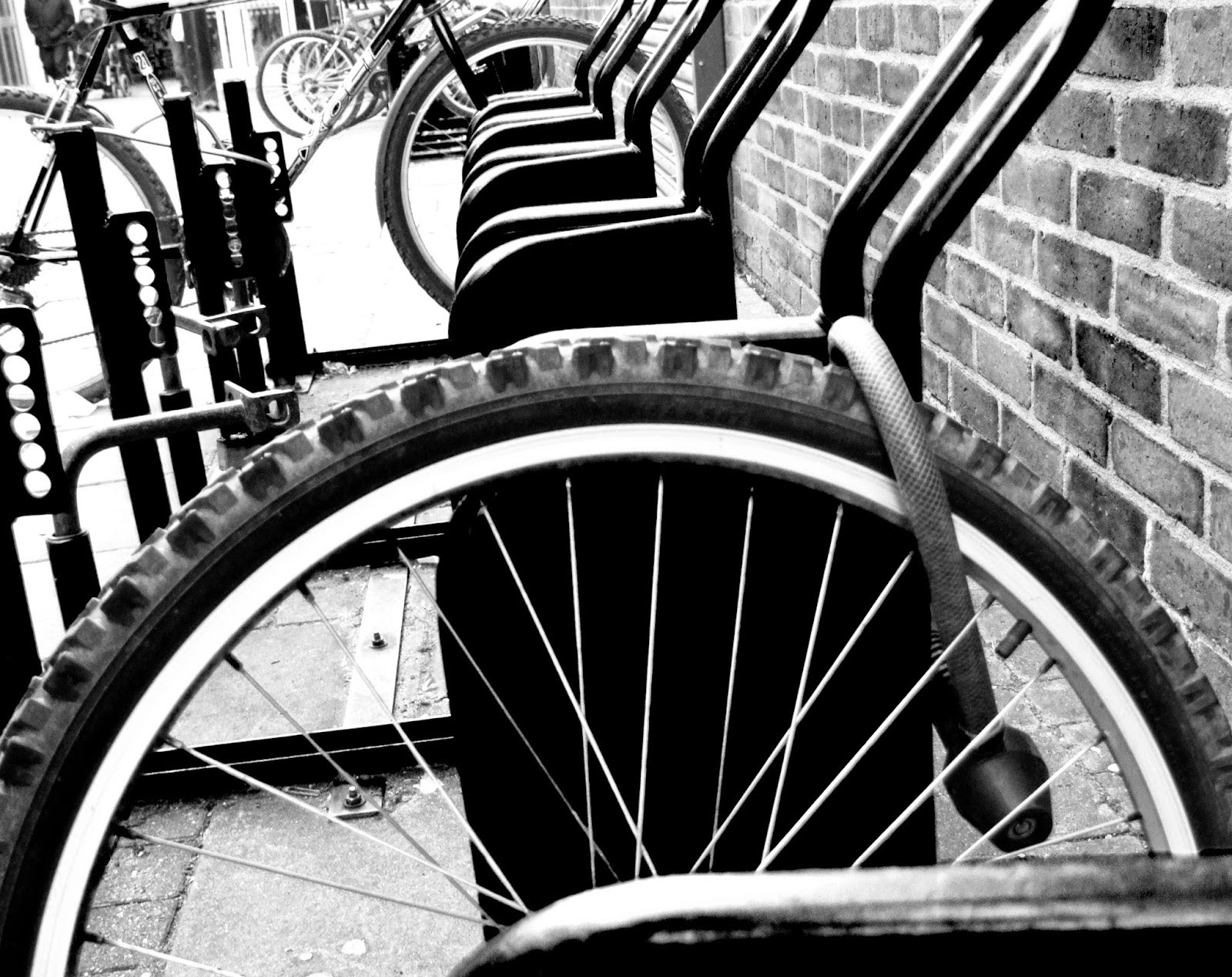
My image attempts to show examples of pattern within common environments. We can see how pattern and repetition is used to create the effect of distance as we see the same objects change over different distances. A black and white filter is used in order to highlight some contrast between light and dark tones within the image. The contrasts cause the pattern and change in distance to be more  visually striking while drawing the audiences attention to certain objects within the frame.

Both of these images can be compared in a number of ways. They both use pattern and repetition in a way that conveys distance through objects changing. A black and white filter is used in both images and uses formal elements such as contrast and tone. Both of these formal elements allow for the audience's attention to be drawn while the form allows for greater detail in the objects that allow for a clearer difference of an object over different distances.


Connecting Essay 4


This image uses multiple flash photography in order to accurately show a range of movement that is made during a skateboard trick. The photographer uses the bright colour tones of the clothing and skin against a dark background in order to capture a clearer range of movement. Within the image, we can see a range of positions and poses in order to show the progression of the movement. The flash of the camera allows for a striking example of contrast to be created. As a result of this, the man is made the point of focus for the audience and they can more easily focus on the range of movements.


My image is an attempt to depict evidence of movement in a single picture. A black and white filter is used to create a clear contrast between the background and the person. This helps to better observe the range of movements that the person is moving in. Since the subject has been exposed to more light, the rage of movement appears to be less solid and is instead represented in aware of movement. The result of this gives the image a more flowing sense of movement as opposed to a more static range. We can also get a sense of the speed that the person is travelling at as the movement becomes more faded the faster the person is travelling.

Both images can be compared in a number of ways. A black and white filter is used to create a contrast between the background and the person within the image. This allows for the audience to better see the range of movements in the image. Light is used in both images to highlight the journey of the people, the first image shows the progression of movement from dark to light while my image shows the progression of movement from light to dark.

Shoot 10 Straight Images


Wednesday, 29 April 2015

Shoot 9 Work Diary

I attempted to use photomontage in a way that allowed me to accurately depict the movement of objects and people in a single image. I looked at photomontage on different scales with people in large environments to objects with on a desktop. Since I wanted the image to show evidence of movement I made sure that the image showed a natural range of movements to show progression of the subject.


This image shows the movement of a person in a large environment. I wanted to incorporate objects within the surrounding environment in a way that added to the journey of the movement. As a result we can see the person sitting, walking and interacting with objects along the way to her destination. A black and white filter is used in order to add tone to the image. I used the tone as a part of the progression. Initially the person starts in a dark lit environment but as she ventures on her surroundings become more brighter as she reaches the end of her destination.


This image shows photo joiner on a smaller scale in order to replicate the movement of a bottle that has just fallen over. I used the label of the bottle to give the effect that the bottle was rolling. I was able to make the photo joiner more convincing by including a black and white filter which helped to create distance between each bottle. Depth has been used within this image through the use of the bottles. The audience can see how the size and shape of the bottles begin to slowly change the further that the bottle gets away.

Progression:

For my next shoot I would like to further explore the theme of evidence in movement in a different way. I would like to experiment with the use of light and different ranges of shutter speed to show movement in a more visually interesting way.


Connecting Essay 3


This image shows injury through portraiture. Dark clothing along with a black background are used with harsh light on the face in order to create contrast. The image uses contrast to direct the audiences attention to the persons face in order to closely observe their injuries. Dark tones are used to reflect the dark subject that the image depicts. The bruises and injuries on the face are highlighted with the harsh light in order to reveal them, this links to how people may attempt to hide their injuries.


My image attempts to highlight themes of injury. I used a black and white with a combination of a black background and a harsh light to highlight shadows within the image. This is used to highlight the injury of the person while reflecting the dark subject of injury. The light and the tones allow for the image to show formal elements such as contrast which helps to highlight some of the other injuries such as the scar with tone and form to highlight the depth of the cut.

Both of these images can be compared. The images attempt to reflect the subject of injury through portraiture. They attempt to use contrasts of dark and light tones to highlight the injuries of the people in a way that grabs the audiences attention. They use dark tones to depict the dark nature of injuries and even suggest the implications that someone may try to hide their injuries from the world. 

Connecting Essay 2


This image features a photomontage of the same person within the image multiple times. This image features a black and white filter that allows for darker tones. The child can be seen interacting with the environment and objects around him in a way that makes the photomontage appear to be seamless. The different positions of the child can be used to depict his movements around the frame, by showing him in different states. The black and white filter highlights the light tones of the sky and beach, along with the dark tones of the children. This creates a contrast within the image, causing the children to become more highlighted in their environment.


My image attempts to use photo joiner to depict evidence of movement around the environment. I attempted to achieve this by having the person interact with the environment by sitting and moving in a way that shows her progression to where she wants to be. The black and white tones are used to create contrasts of the person and her environment. The contrasts are also used to further aid the visual representation of her range of movement, originally, the person starts of her journey in very dark tones and as she begins to reach the end of her journey she moves to a lighter area of the image.

Both of these images can be compared in a number of ways. Photomontage is used in a way that reflects a range of movements of one person. A black and white filter is used in a way that highlights formal elements such as contrast to add tone to the image in a way that is more visually interesting than a coloured picture would be. This also causes the audience to focus on the person which is made the subject of each image.

Connecting Essay 1


This image is from photographer Bobby Neel Adams. The picture shows two different photographs of the same person years apart. These two images are merged together in a way that creates a striking contrast within the image. We can see that there is a clear difference in features such as grey hairs and wrinkles but the image is brought together in a way that appears to look like one portrait. To make the contrast more eye-catching, Adams has made the divide between the picture appear as a tear, allowing for the pictures to blend better while showing a clear difference between both images.


In my image, I attempted to create evidence of someone who has aged. I opted to show this in a way that created a clear contrast that would be visually striking. Since I lacked the resources to compare the subject with an actual image of him when he was younger I had to age the image in photoshop. I created a clear contrast by making a dividing line down the centre of the person's face. Here we can see the comparison of blond and grey, smooth skin and wrinkles. The benefit of using photoshop allowed me to make the age gap more dramatic than if I simply compared an image of when he was younger.

Both of these images can relate in a number of ways. They both include similar formal elements of contrast between the age differences. We can see a number of features such as greyed hair and wrinkles that combine in both images to depict a visual representation of ageing. Both images attempt to make the contrast more visually striking by matching the comparison into one portrait image. Form can be seen in both images in order to highlight some ageing features such as wrinkles through shadow.

Thursday, 16 April 2015

Exam Plan

For my exam I will need to shoot near home and use the forest location behind my house. I will need to use a tripod and my own camera for the shoot. I will shoot evidence using photoshop, and simple props such as litter and track marks. I will begin to edit my images on thursdays lesson. I will get a lift to and from college, and will return at around 4:15 to sign out.


For my exam I will need to shoot near home and use the forest location behind my house. I will need to use a tripod and my own camera for the shoot. I will shoot evidence using photoshop, and simple props such as litter and track marks. I will begin to edit my images